TY ENNIS // STUPID MAN

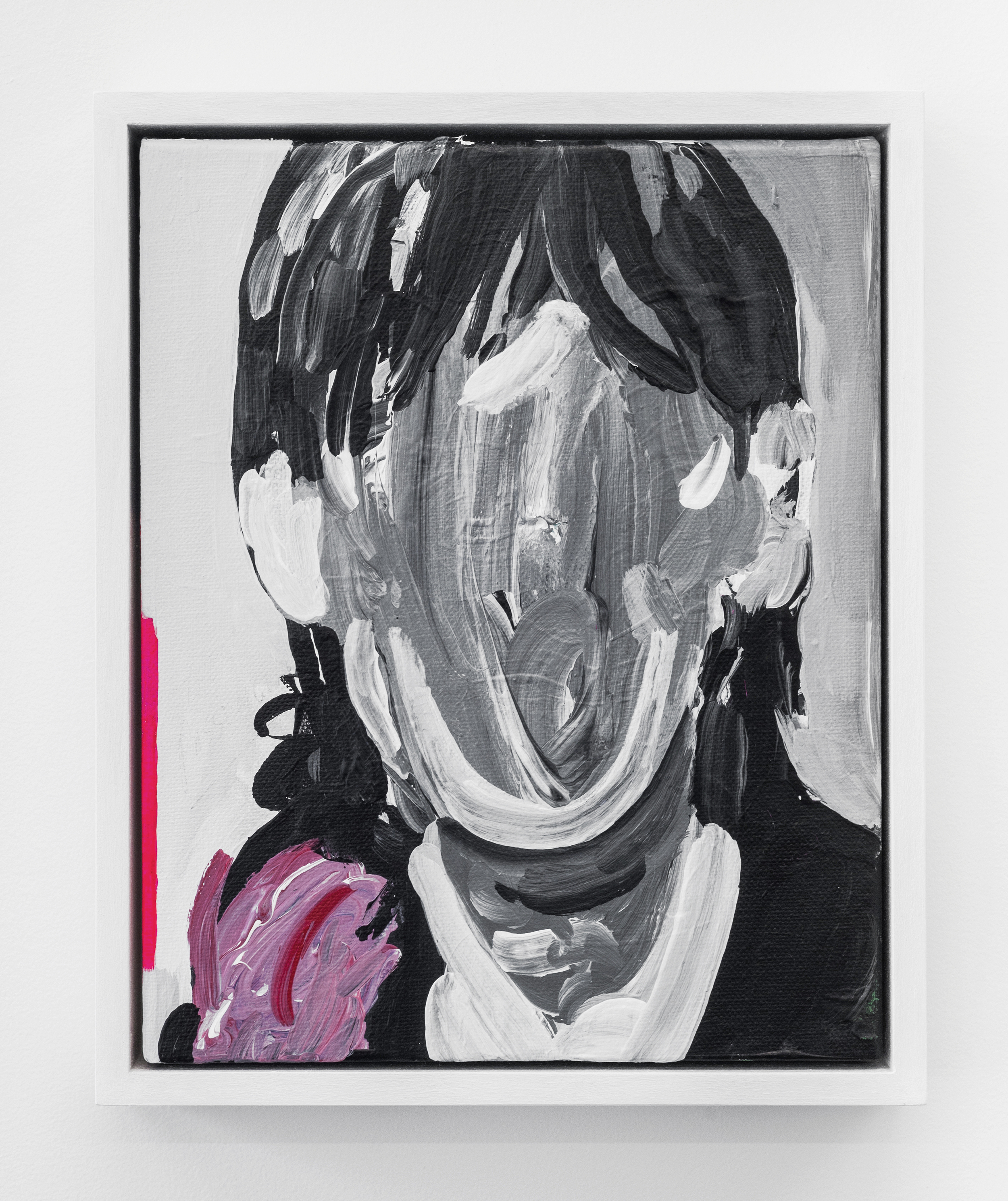
Stupid Man by Ty Ennis, on view through June 20, 2016 (images Mario Gallucci Studio)

Stupid Man by Ty Ennis, on view through June 20, 2016 (images Mario Gallucci Studio)

Clocked In (Sam Sheepdog), 2016, acrylic on canvas, 14 x 11”

Clocked In (Sam Sheepdog), 2016, acrylic on canvas, 14 x 11”

El de la rollona (Mama’s Boy // After Goya), 2016, acrylic on canvas, 14 x 11”

El de la rollona (Mama’s Boy // After Goya), 2016, acrylic on canvas, 14 x 11”

Iggy Papa, 2016, acrylic on canvas, 10 x 8"

Iggy Papa, 2016, acrylic on canvas, 10 x 8"

On view May 13–June 20, 2016
Opening reception Sunday, May 15 (3–6PM)
Closing reception & catalog release party Saturday, June 18 (5:30–7PM)

For his second solo exhibition at Nationale, Ty Ennis presents Stupid Man, a series of small black & white paintings that explore his present day-to-day life as an artist and young father with a full-time day job. Like most of his past work, they tell individual stories that are all part of a larger narrative. This new body of work, in its loose composition and black and white presentation, adds a more raw and stripped down layer to the ongoing monologue which has been the crux of Ennis’s work for the past twelve years. Although deeply personal and intimate, Stupid Man ultimately explores themes that inspire and challenge us all. 

Ty Ennis (born 1981, Spokane, WA) lives and works in Portland, OR, where he graduated from Pacific Northwest College of Art in 2003 with a BFA in Printmaking. His work was previously included in the 2006 Oregon Biennial at the Portland Art Museum. He has exhibited across Portland at Nationale, Open Gallery, New American Art Union, Pulliam Deffenbaugh, and the Art Gym at Marylhurst University; in Seattle, WA, at Prole Drift; and in Los Angeles, CA, at William H Bothy. Ennis is the recent recipient of a Project Grant from the Regional Arts & Culture Council and a Career Opportunity Grant from the Oregon Arts Commission. He joined Nationale as a represented artist in the spring of 2013.

This project was funded in part by the Regional Arts & Culture Council

INTERVIEW: DELANEY ALLEN

We recently caught up with Delaney Allen to discuss his current show A R T I F A C T  now on view at Nationale through May 9, 2016. 

Gabi Lewton-Leopold: Your current series A R T I F A C T takes on many themes and subjects, from costumed self-portraits to dramatic landscapes. Although we’ve seen these elements before in your earlier projects, there seems to be a deliberate move towards artifice and manipulation—digital collage, use of a green screen—within these images. Is digital alteration important to the series and to the overarching narrative?

Delaney Allen, Figure 1.14 (Self Portrait), 2016

Delaney Allen: Upon first examination, the intention is for one to enter into this world with a sense of mystery or bewilderment. Acting as a larger, overarching theme, the creation of something unknown, yet familiar, exists throughout A R T I F A C T. Manipulation is present but is a lesser, casual theme.

Speaking more towards manipulation, those devices were tools that I used like the application of camera itself. Utilizing those elements granted me the means to further the series in the way in which I am accustomed to working—individually without assistants (on location or in the studio). It also allowed the installation of new characters into the body of work, dissuading possible repetitiveness from reoccurring throughout. Those small facial glimpses were important, but the factors into their creation were less so. Once that revelation of digital manipulation is known concerning the creation of some imagery, the viewer can change their approach to the series. Eventually, that investigation and process came more as a means to problem solving and expansion than anything else.

GLL: Art historical references come across in the series—images referencing Dutch still life, Cubism, Dada, and Surrealism, among other influences. How do you see this work in relation to these movements of the past? 

DA: I referenced those movements as I began to frame the series. They were specifically key in building the still life imagery. When still life painting began, as in the early Dutch paintings, it started with flowers or kitchen items laid out on the table. At that point, they were referred to as fruit or flower pieces. With that, it became vital to adopt the idea into A R T I F A C T to lay the groundwork for building the fictional history. 

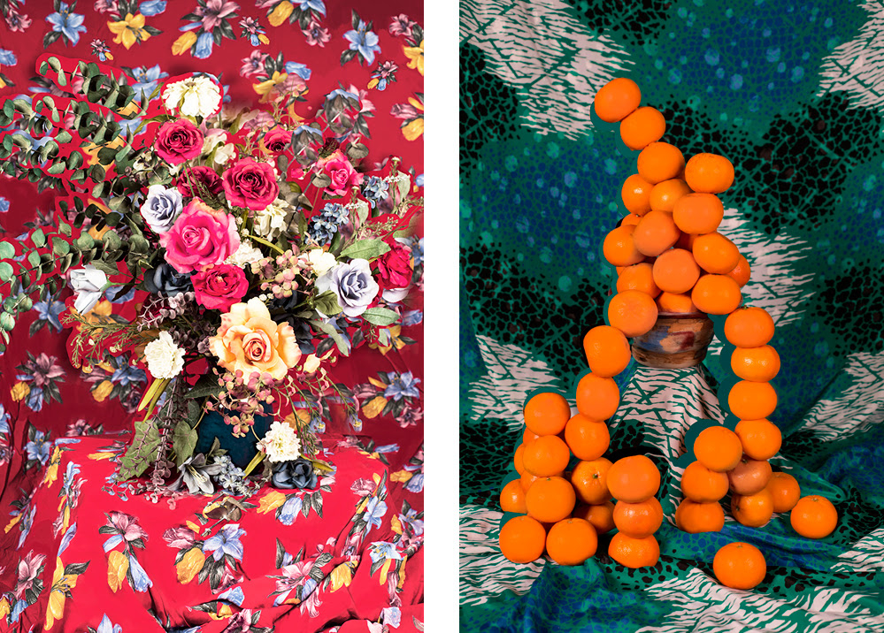
Figure 3.2Figure 3.3, and Figure 3.8 were direct responses to that early investigation. But with those familiar elements in place, I looked to move beyond a direct acknowledgment, feeling a need to blur the lines of art history. Figures 3.2 and 3.3, at least to me, show tendencies towards Cubism specifically.

Delaney Allen, Figure 3.2 (Still Life), 2016
Delaney Allen, Figure 3.3 (Still Life), 2016

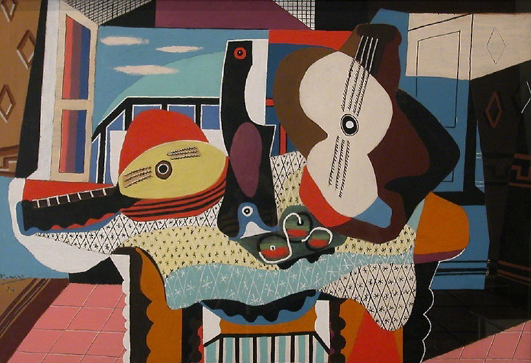
Pablo Picasso’s still life, Mandolin and Guitar became a prominent fixture of reference when I began to dissect the images and build them back up again in the frame. Looking at Mandolin and Guitar, one can identify the similarities within my still lifes as I attempted to flatten and distance portions of the images. The same can be found in Figure 3.8 and its association with paintings like Georges Braque’s The Studio (Vase before a Window).

Pablo Picasso, Mandolin and Guitar, 1924

Georges Braque, The Studio (Vase before a Window)1939

Using mundane objects found within the studio, Figure 3.8 emulates the Cubist manner of breaking up and flattening of the image through color and line.

Delaney Allen, Figure 3.8 (Still Life), 2016

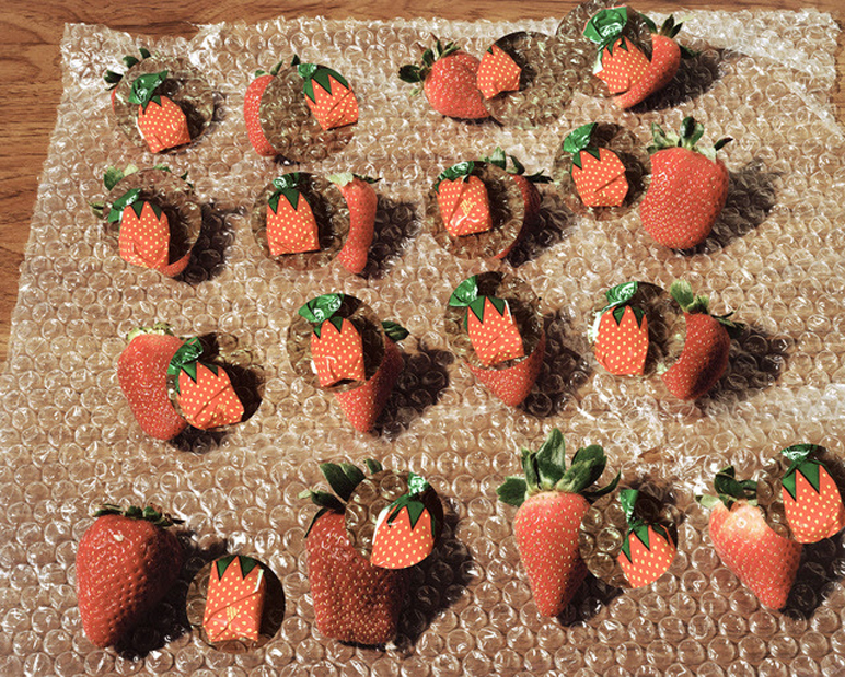
At the same time, those photographs, as well as others throughout the series, pull from the “New Formalism” movement occurring in photography at the moment. Artists such as Lucas Blalock and Daniel Gordon became aides when needing to look away from what one might consider straight photography. Although most New Formalism photographers give away their hand at play, I collected the ideas that their work is based on and implemented those in a less detectable way. While their photographs typically display the use of digital editing, I tried to minimize the moments in which I gave details away using similar processes.

Lucas Blalock, Strawberries (Fresh Forever), 2014

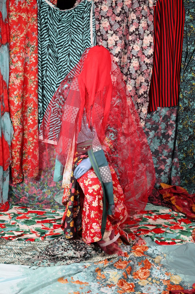
GLL: In many of your studio self-portraits, which are often filled with layered and textured fabrics, you allow us to see the materials used to create the work—tape, unprinted edges of fabric, the studio wall, your foot peeking out beneath fabric, and so forth. These moments take us out of the fantasy and expose the process. Why do you choose to include these elements? 

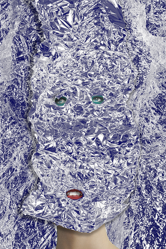
DA: With the studio portraits, I implemented certain elements and techniques when producing the work. Those components range from the flattening of the subject into sections of the background, veiling or masking occurring that mimicked some of the more abstracted landscape photography in the series, digital manipulation and smaller moments exposing the process like you mentioned. With the disclosure of those smaller moments specifically, my intention was to show the artist's hand in a way that would possibly direct the audience, at times, to questioning what they are seeing.

Beginning with the title of the work—A R T I F A C T—my objective was to build this fictitious community and history. But playing off the ideas of fact versus fiction, and even more pointedly, the belief in the history of photography that what we view is truth, I aimed for entry points that could allow for a sense of confusion or questioning that authenticity. We’re naturally taught to believe what is placed in front of us is truth. Knowing this, I purposefully designed and executed small giveaways hidden throughout the series that could discount that idea.

Delaney Allen, Figure 1.10 (Self Portrait), 2016

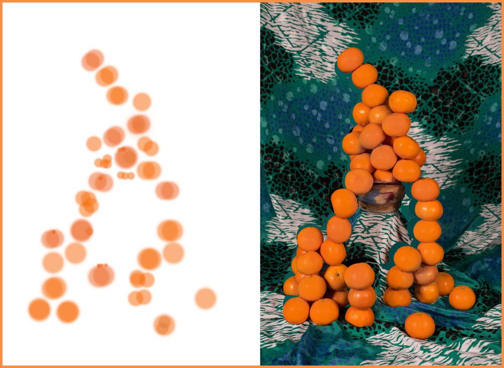
Expanding beyond the self portraits, these elements develop throughout the body of work. Still life images mixed physical and digital manipulation. Photographs would be dissected, at times applying new affects through rephotographing the imagery before doing any digital manipulation. Figure 3.4 exists completely as a level of manipulation to Figure 3.3

Delaney Allen, Figure 3.4 (Still Life), 2016
Delaney Allen, Figure 3.3 (Still Life), 2016

The image is solely a layer built in Photoshop that was applied to the still life. With its inclusion, it references that artist's hand previously mentioned. Landscape images contain these components as well. Paint applied in post-work allowed me, as the artist, to further control the environment that I built, as well as giving clues into the unnatural world that was assembled. Ultimately, what is displayed as fact will contain an either sizable or minuscule fiction.

GLL: Self-portraiture has long been a strong theme in your work. You’ve done so much to hide yourself, from covering your face in fabric, to now, in this current series, actually superimposing another face on your body. I can really feel the tension between presence and erasure of the artist within A R T I F A C T. What are your thoughts on the importance of self-portraiture within your practice? 

Delaney Allen, Self Portrait No. 1, 2011

Delaney Allen, Figure 1.6 (Self Portrait), 2016

DA: The importance of self-portraiture is huge in my approach to making. Dating back to when I was introduced to French auteur theory as an undergraduate studying film, I found issues with the amount of authority and collaboration in film and who, ultimately, could control aspects of the final product. I slowly began the shift away from filmmaking and towards photography, eventually settling on the mindset that self-portraiture, to me, is a truer form of individual art-making.

Who ultimately owns a photograph in regard to its finalized outcome? When considering portrait photography, does the truth lie on the sitter or the photographer, or does a combination lead to a partnership? Questioning these involvements within photography has been the root of how I fashion my practice, specifically in my handling of portraiture. With A R T I F A C T, the management of the sitter/photographer issue led the work to a slight blurring of lines when incorporating new approaches and techniques. Spending months scouring various fashion magazines, I amassed dozens of assorted aspects of the human body with the idea of assimilating them into the series. Ultimately building this fantasy-driven community from scratch using my frame as a template. With this unique approach, I retained control of the figure while allowing the slight, unveiled components to build individual portraits for the series.

As mentioned, with the presence and erasure of the artist, the concept of blending found imagery with self-portraiture granted the series the illusion of a society built out of the artist. If I explicitly used myself, my facial features in each portrait, A R T I F A C T would have suffered a limited narrative, failing to root the viewer in the environment. Purposely masking figures, incorporating others faces and collaging of images, allowed for a development within my particular history of self-portraiture.

GLL: Along with self-portraiture, the natural world is a consistent subject as well. At times they act as contrasting elements, and in other images they meet (specifically in Figure 1.1Figure 1.3Figure 1.14). What are your thoughts on how these different subjects coalesce in one body of work? 

DA: It was predetermined while scouting and shooting to pursue and demonstrate, through scenery, the themes constructed around the series. The inclusion of the abstracted photographs mimic the shrouding apparent within the portrait work. Shot in Oregon, California, and Texas, images such as Figure 2.6 contribute to the collapsed frame, allowing for a disorientation apparent in the work. Although working in a more straight photography means, A R T I F A C T ’s abstracted landscapes place the viewer into the unfamiliar with slight, albeit abstruse, glimpses into the perceived world.

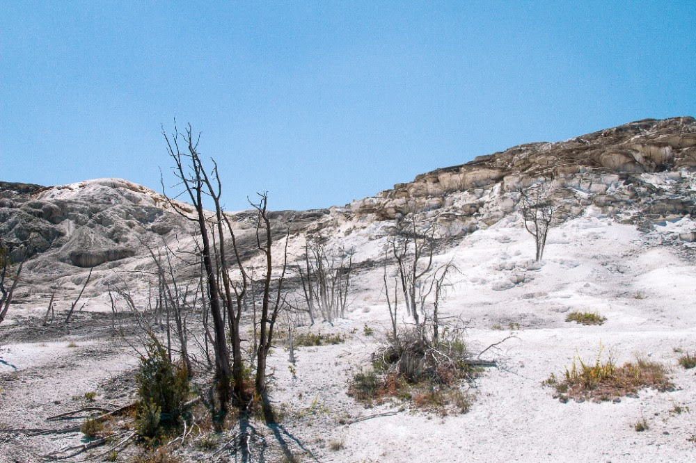
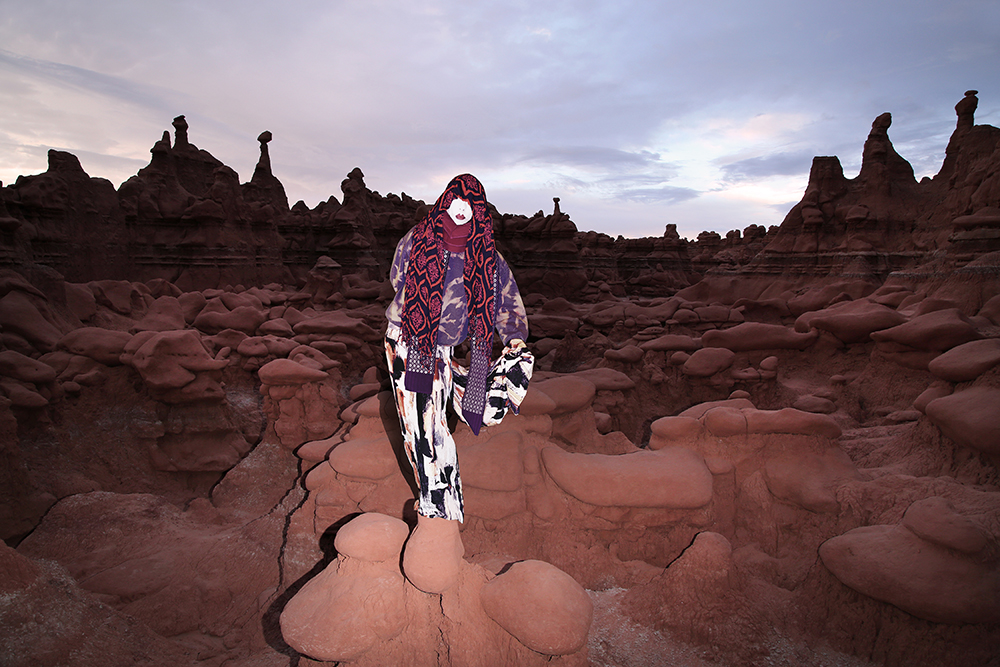
To a lesser degree, the series further recognizes the imaginative world through Figure 2.3 and Figure 2.11. The inclusion of these two images deliberately presents a broader look into nature, fighting against the disorientation of the other images and giving pause within the work. Each image, photographed in Utah and Wyoming, were investigated for their unworldly look, and ultimately implemented into the creation showcasing a more vast look into the perceived world.
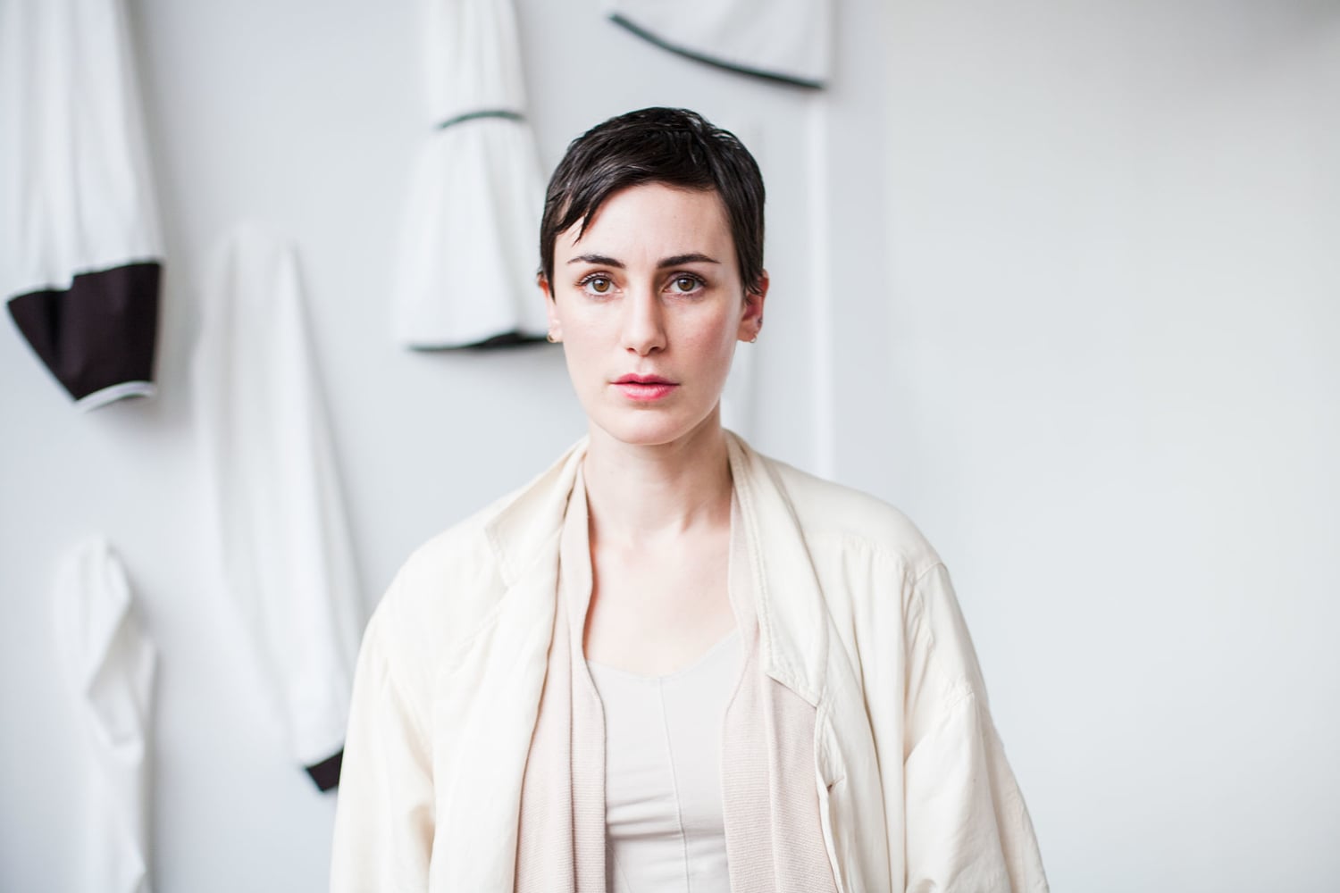
Delaney Allen, Figure 2.3 (Documentation of Landscape), 2016

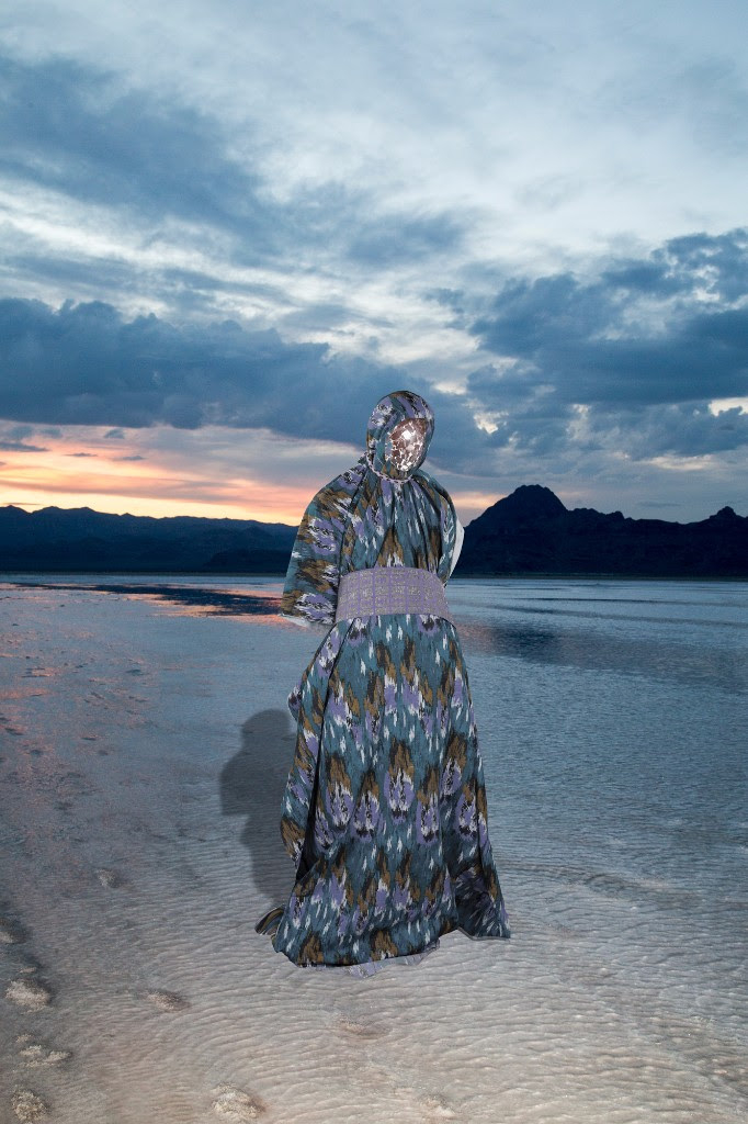
Actualizing the addition of self-portraiture into natural scenes acted as the biggest strengthening for the series as the editing process began. These images, like you mention with Figure 1.1, 1.3, and 1.14, were thought to be the foundation of the work when I began the series. This endeavor was crucial to the development of a conceivable world connecting and uniting the images as a whole. Necessary to the evolution of building a history, these photographs were first generated as varying landscape imagery sans figures. Shot at dusk or night while traveling throughout the deserts of the Western US, experimentation with flash photography’s effects within the frame, led to the materialization of the final images. After collecting photographs shot in nature during various trips, I moved into the studio to photograph each figure that would ultimately resolve my initial vision. The incorporation of each figure into the selected backgrounds supplemented the series, securing constructed, snapshot-like photographs lending plausibility to the group of people.

Delaney Allen, Figure 1.3 (Self Portrait), 2016

GLL: We’ve seen the inclusion of sculptural elements in this show and Getting Lost in 2014. What was the initial impetus for going this direction? Do you have plans to go even further towards installation-based work?  

Delaney Allen, Figure 4.3, 2016

DA: That specific direction was a challenge I set for myself at the start of the new work. From my first series in 2010, until now with A R T I F A C T, I’ve tried to include a minor twist in my approach, creation, and completion of each body of work. I wanted to add to my toolbox as an artist with the inclusion of sculptural and painting elements. I needed that test to decipher something different.

At times, it feels artists can become stagnant in their growth as makers. We make a new series, some success or recognition comes, and we either feel comfortable with reapplying that approach, or are fearful to probe and develop beyond that. I assess each new series with a mindset that the application of an unexpected element, can and should arise, confronting the artist as well as the audience. With A R T I F A C T specifically, it moves beyond just the sculptures and paintings to include the understanding of digital editing, and ultimately an understanding of myself. Can I make these images I’m seeing in my head a reality with the incorporation of editing techniques I’ve never tried? Am I comfortable wandering into the woods alone at night for a photograph? Will waiting until the sun sets in the middle of the desert enable me to get the picture I’m envisioning even though I’ll be hiking back to the car in the dark? The entirety of these elements led me, I feel, to making the most challenging work I have to this point in my career. With that being said, I would expect for each subsequent body of work to examine these issues again. At the moment, I can’t see having a straight sculpture-based show in the future (but don’t hold me to that).

Delaney Allen, Figure 1.5 (Self Portrait), 2016
Delaney Allen, Figure 3.7 (Still Life), 2016
Delaney Allen, Figure 2.1 (Documentation of Landscape), 2016

MAY DAY SALE (MAY 1–9)

Nationale is happy to share news of its May Day sale, May 1–May 9, 2016. Items from our home & beauty section—including MCMC fragrances, GRAIN design, Iacoli & McAllister, papier d’Armenie—and select art books will be greatly discounted (up to 40% off). Sale items will also include other beauty lines (Jao & Nuxe), select magazines (Tunica & Lapham’s), small press, and one-offs from local makers (Liam Drain, The Granite, Fredrik Averin). For the budding art collector, the sale extends to the backroom gallery with 10% off art works from past shows—the perfect time to start or add to your collection! 

SPECIAL EVENT BOOK SIGNING: OLIVIA BEE'S KIDS IN LOVE

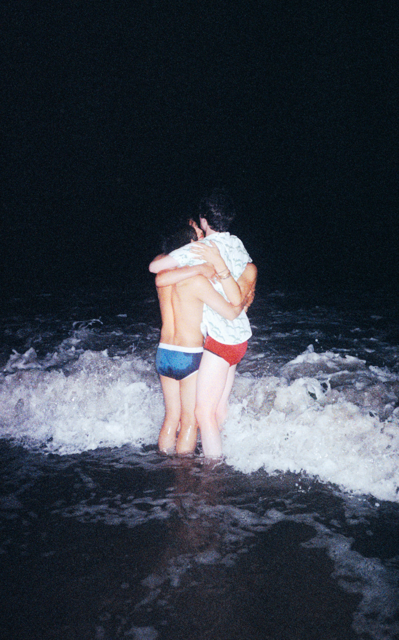
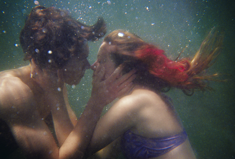
Olivia Bee, Pre-Kiss, 2010, from Olivia Bee: Kids in Love (Aperture, 2016) © Olivia Bolles

Olivia Bee, Pre-Kiss, 2010, from Olivia Bee: Kids in Love (Aperture, 2016) © Olivia Bolles

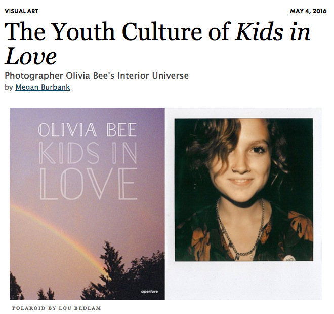
Nationale is pleased to announce a special book signing event with Portland native Olivia Bee on Saturday, May 7 (4–5:30PM) to celebrate the release of Kids in Love (Aperture Foundation, April 2016, 136 pages, hardcover, $39.95). The Portland band Super Hit (Kyle Handley & Co.) performs acoustically at 5:30PM. Kids in Love can be pre-ordered here. 

Kids in Love is the first book by the twenty-two year old photographer Olivia Bee, whose work follows in the tradition of Nan Goldin and Ryan McGinley. She is celebrated for her dreamy and evocative portraits of friends, new loves, and the young people around her, all on the brink of adulthood and new possibilities. Bee gives voice to the self-awareness and visual fluency of the millennial generation; her vision of capturing the world around her “in the moment” fits in seamlessly with the image-laden world we live in today. In a conversation with Bee included at the end of the book, Tavi Gevinson, founding editor of the online magazine Rookie, writes about what it means to make work that is raw and vulnerable, the phenomena of being “nostalgic for twenty seconds ago,” and other shared experiences.

Olivia Bee (born in Portland, Oregon, 1994) is based in Brooklyn. After the recognition received for her photographs on social media, Converse commissioned Bee, at the age of fifteen, to shoot her first ad. She has since gone on to shoot campaigns for brands such as Hermès, Levi’s, and Apple, and editorial features for publications such as Vogue, Vice, New York, the New York Times, and Le Monde. Her photography has been featured in solo shows at Agnès B, New York, and Bernal Espacio, Madrid. In January 2016, Bee was featured as one of Forbe’s “30 under 30” to watch list of artists and style innovators, “creating and designing the future, from the gallery to the runway.”
THE GREAT JAIK FAULK, LADIES & GENTLEMEN

Image ©Kyle Glenn

Image ©Kyle Glenn

What a great surprise to find this post about gallery artist Jaik Faulk on my Facebook feed this week. I do not know Kyle Glenn, but he sure captured Jaik's spirit perfectly!

Portrait of the Day:
Painter Jaik Faulk in his home studio in Lafayette, LA. Jaik was my ambassador to cajun country for the day. It was great to experience the life and culture of Lafayette. We started off with daiquiri tasting, crawfish and beer in the backyard, then went out for a little cajun music jam sesh and two-stepping. Today he introduced me to my first Louisiana po boy, then took me down to try to catch sight of some alligators in the swamp (no luck this time.)
I met Jaik in Portland, and we spent some time in San Francisco together before he moved back to Lafayette. It was awesome to see his excitement for his hometown and the culture of the area. I can’t wait to get back down there for a longer period of time. Maybe when he gets his residency program off the ground…


ARTIFACT // DELANEY ALLEN

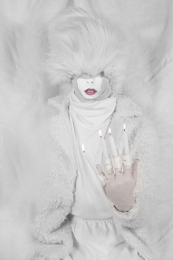
Delaney Allen, Figure 1.2 (Self Portrait), 30 x 20", archival pigment print, 2016

Delaney Allen, Figure 1.2 (Self Portrait), 30 x 20", archival pigment print, 2016

Delaney Allen, Figure 3.2 (Still Life), 30 x 20", archival pigment print, 2016

Delaney Allen, Figure 3.2 (Still Life), 30 x 20", archival pigment print, 2016

Delaney Allen, Figure 4.4, wood panel, acrylic paint chips, acrylic paint, epoxy, 2016

Delaney Allen, Figure 4.4, wood panel, acrylic paint chips, acrylic paint, epoxy, 2016

Delaney Allen, Figure 1.6 (Self Portrait), 30 x 20", archival pigment print, 2016

Delaney Allen, Figure 1.6 (Self Portrait), 30 x 20", archival pigment print, 2016

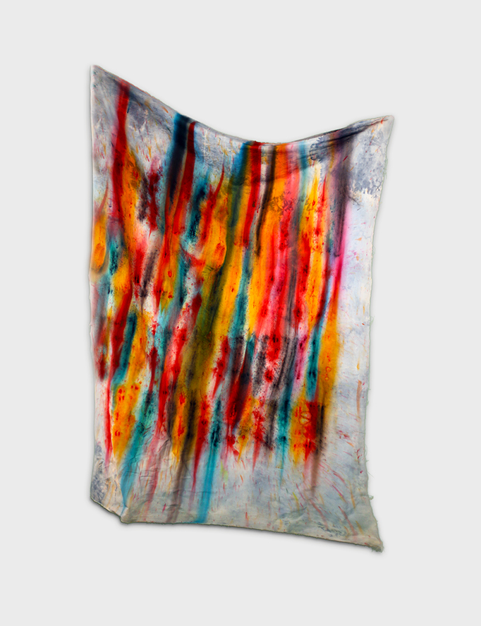
Delaney Allen, Figure 4.2, cotton linen, pigment, bleach, 2016

Delaney Allen, Figure 4.2, cotton linen, pigment, bleach, 2016

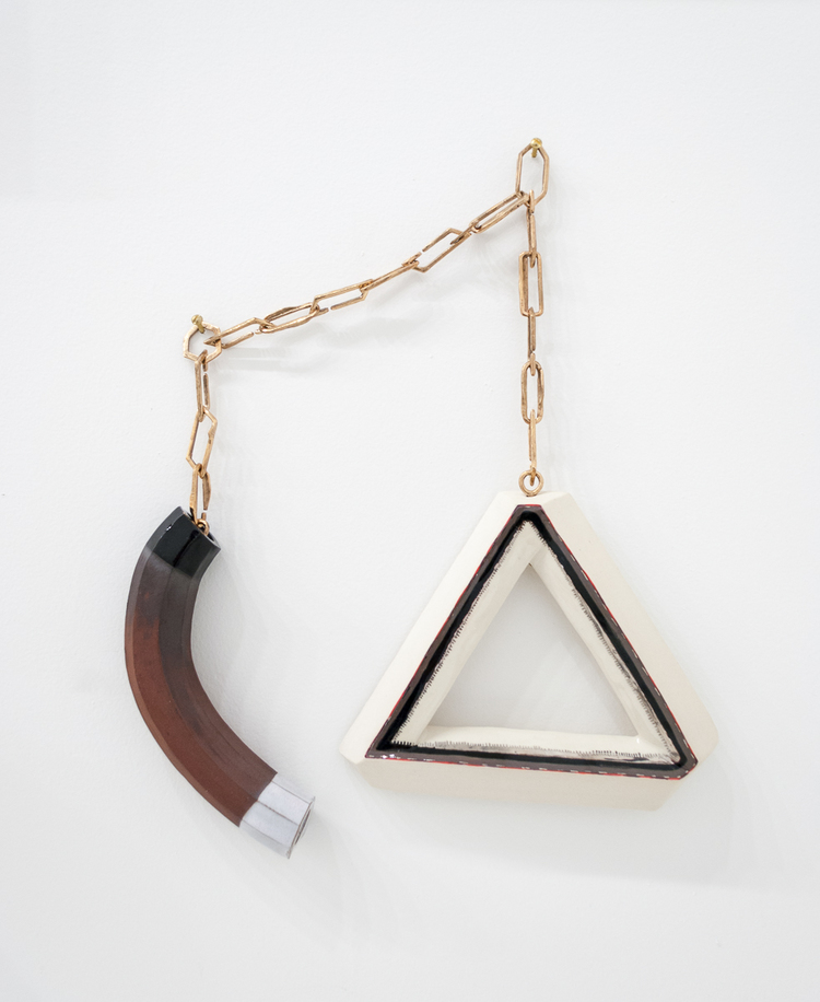
Delaney Allen, Figure 4.3, ceramic, plexiglass, acrylic paint, spray paint, Epoxy, 2016

Delaney Allen, Figure 4.3, ceramic, plexiglass, acrylic paint, spray paint, Epoxy, 2016

Delaney Allen, Figure 1.1 (Self Portrait), 20 x 30", archival pigment print, 2016

Delaney Allen, Figure 1.1 (Self Portrait), 20 x 30", archival pigment print, 2016

Delaney Allen, Figure 4.1, driftwood, acrylic paint, 2016

Delaney Allen, Figure 4.1, driftwood, acrylic paint, 2016

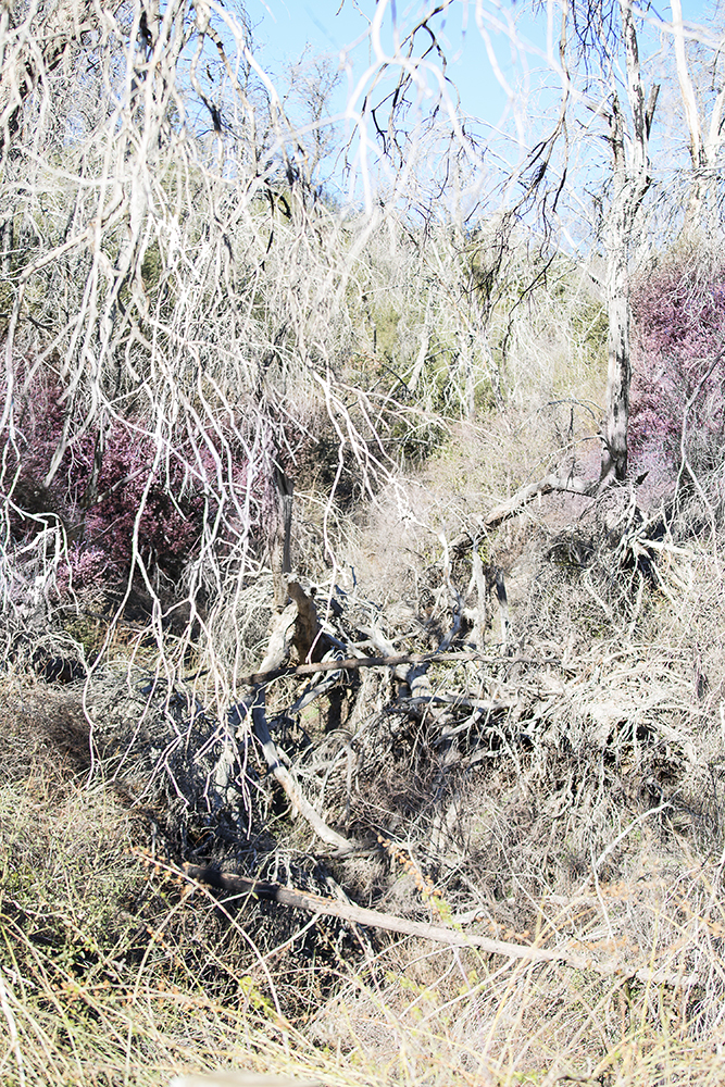
Delaney Allen, Figure 2.4 (Documentation Of Landscape), 30 x 20", archival pigment print, 2016

Delaney Allen, Figure 2.4 (Documentation Of Landscape), 30 x 20", archival pigment print, 2016

Delaney Allen, Figure 1.7 (Self Portrait), 30 x 20", archival pigment print, 2016

Delaney Allen, Figure 1.7 (Self Portrait), 30 x 20", archival pigment print, 2016

Delaney Allen, Figure 4.5, cotton rug, pigment, spray paint, acrylic paint, bleach, ashes, 2016

Delaney Allen, Figure 4.5, cotton rug, pigment, spray paint, acrylic paint, bleach, ashes, 2016

Delaney Allen, Figure 2.1 (Documentation Of Landscape), 30 x 20", archival pigment print, 2016

Delaney Allen, Figure 2.1 (Documentation Of Landscape), 30 x 20", archival pigment print, 2016

While we await Gabi's interview of Delaney, I wanted to share here images from his current exhibition, A R T I F A C T. For a price list, please email us info@nationale.us

EMILY COUNTS AT CARL & SLOAN / IMAGES

So blown away by gallery artist Emily Counts' new work currently on view at North Portland friends and gallery Carl & Sloan. Through the generous support of a grant from the Regional Arts & Culture Council, Counts was able to realize her ideas on an impressive scale. We were thrilled to experience these new pieces in person during the reception and we hope you will, too. Carl & Sloan is open on Sundays from 12—5 p.m. and by appointment. The exhibition is on view through April 17, 2016. Congratulations to Emily, Ashley, and Calvin on making such magic happen!

SPRING BUDS // ANNIE McLAUGHLIN

Annie McLaughlin, Bareback Meanderer (A Lonely Teenage Broncin' Buck), 2016, gouache on paper, 24 x 18”

Annie McLaughlin, Bareback Meanderer (A Lonely Teenage Broncin' Buck), 2016, gouache on paper, 24 x 18”

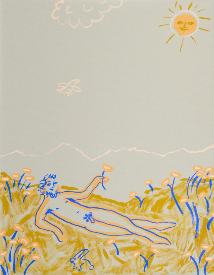
Annie McLaughlin, Poppy Field Kickback (Eastern Sierra Nudies), 2016, gouache on paper, 14 x 11”

Annie McLaughlin, Poppy Field Kickback (Eastern Sierra Nudies), 2016, gouache on paper, 14 x 11”

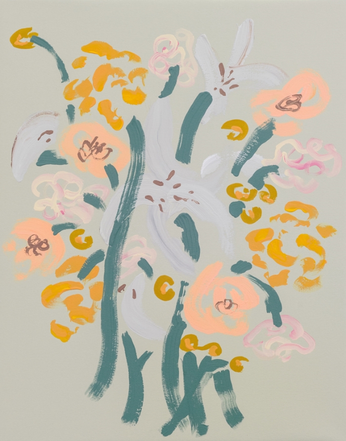
Annie McLaughlin, Carnations, Marigolds, Lilies, Peonies, 2016, gouache on paper, 14 x 11”

Annie McLaughlin, Carnations, Marigolds, Lilies, Peonies, 2016, gouache on paper, 14 x 11”

Annie McLaughlin, There’s Pansies, That’s for Thoughts, 2016, gouache on paper, 14 x 11”

Annie McLaughlin, There’s Pansies, That’s for Thoughts, 2016, gouache on paper, 14 x 11”

SPRING BUDS // LORA BAIZE

Lora Baize, You Saw Me, 2016, acrylic and enamel on panel, 23 3/4 x 18”

Lora Baize, You Saw Me, 2016, acrylic and enamel on panel, 23 3/4 x 18”

Lora Baize, Blue Moon, 2016, acrylic and enamel on panel, 20 x 16”

Lora Baize, Blue Moon, 2016, acrylic and enamel on panel, 20 x 16”

Lora Baize, Standing Alone, 2016, acrylic and enamel on panel, 11 x 14”

Lora Baize, Standing Alone, 2016, acrylic and enamel on panel, 11 x 14”

Lora Baize, Off the grid, DP 411, 2016, acrylic, enamel, and frit on panel, 11 x 15”

Lora Baize, Off the grid, DP 411, 2016, acrylic, enamel, and frit on panel, 11 x 15”